Articles on HTML and CSS


Introduction to Website Development
Websites have a Client-Server architecture as we all know, the client here refers to the user who is accessing the information on the web by using a physical device that connects to the internet such as a Mobile phone, Computer etc. Server is another Computer or Software which responds to user request and sends back the required information to the user. These actions are performed by the medium called HTTP (Hypertext Transfer Protocol) is the set of rules for transferring files -- such as text, images, sound, video and other multimedia files -- over the web. Some the examples of servers are Apache, Google Web Server (GWS) etc. The Apache HTTP Server Project is an effort to develop and maintain an open-source HTTP server for modern operating systems including UNIX and Windows and Google Web Server (GWS) is proprietary web server software that Google uses for its web infrastructure. GWS is used exclusively inside Google's ecosystem for website hosting. In 2008 GWS team was led by Bharat Mediratta.
A Brief Intro to HTML
HTML stands for Hyper Text Markup Language. HTML is the standard markup language for creating Web pages. HTML describes the structure of a Web page. HTML consists of a series of elements. HTML elements tell the browser how to display the content.
The basic structure of an HTML document is as follows..
<!DOCTYPE html>
<html lang="en">

<head>
    <meta charset="utf-8">
    <meta name="viewport" content="width=device-width, initial-scale=1.0">
    <title>WebPage</title>
</head>

<body>

</body>

</html>
An HTML document is primarily divided into two parts: Head & Body, which consist of Tags, and formal name Elements. An HTML element is a component of an HTML document that tells a web browser how to structure and interpret a part of the HTML document. HTML elements can contain formatting instructions, semantic meaning, and content. The head tag contains information about the web page although it will not visible on the page. The content written in between the tags in the body tag is visible on our web page.
Let's see some of the basic HTML tags
h - tag
h - tag defines heading, it is used to write headings on a webpage.
p - tag
A paragraph always starts on a new line, and browsers automatically add some white space (a margin) before and after a paragraph.
img - tag
The img tag is used to embed an image in an HTML page. Images are not technically inserted into a web page; images are linked to web pages. The img tag creates a holding space for the referenced image. The img tag has two required attributes: src - Specifies the path to the image.
a - tag
tags in HTML are link tags that hold hyperlinks to other pages, or anchors on the same page
CSS(Cascading Style Sheets)
Cascading Style Sheets (CSS) is a stylesheet language used to describe the presentation of a document written in HTML
Let's see some of the CSS Selectors & Pseudo Elements,
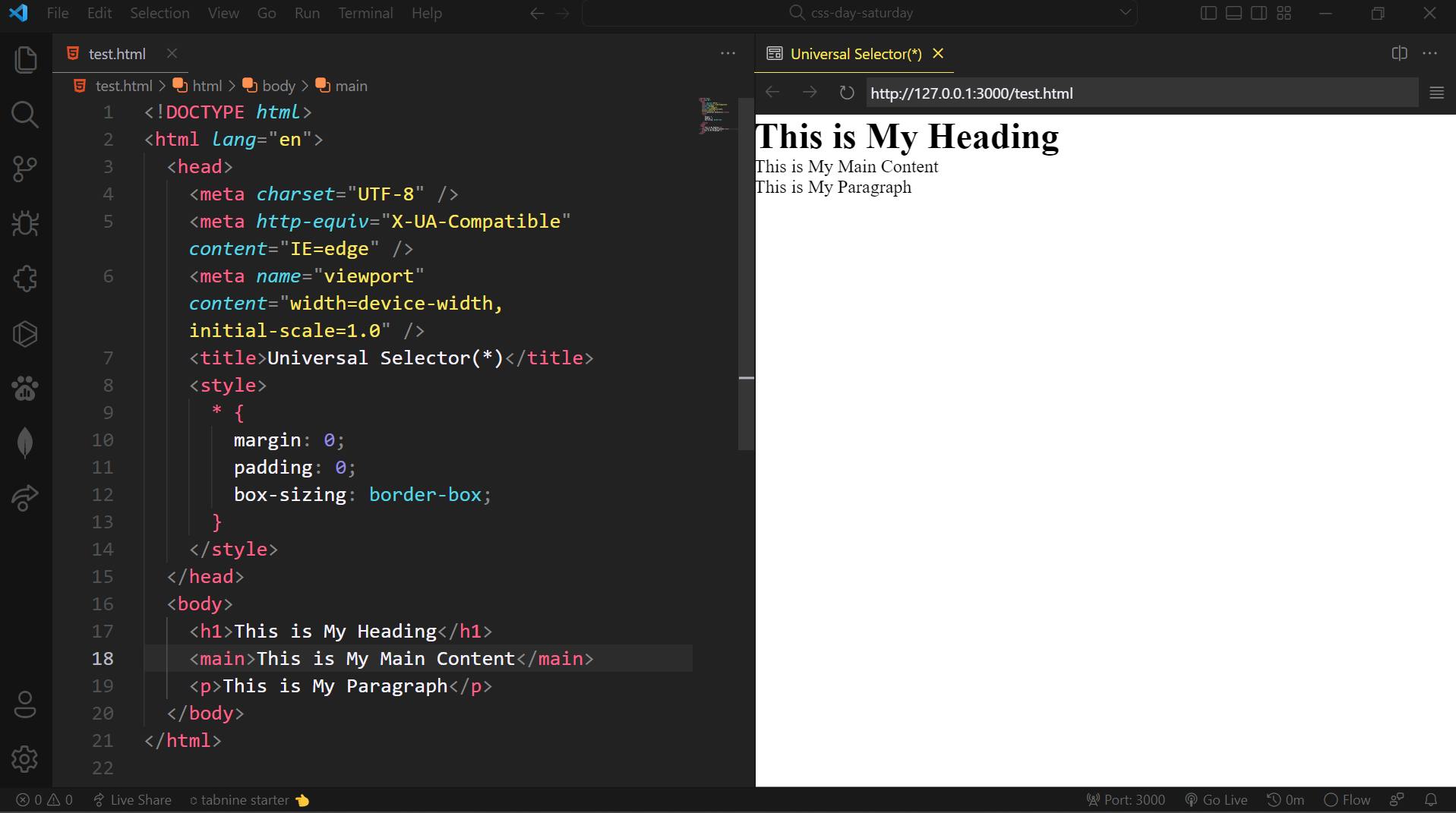
1. Universal Selector (*)
The Universal Selector is the ***** in CSS. The asterisk character. The Universal selector can be used to select any type of element in an HTML Document.
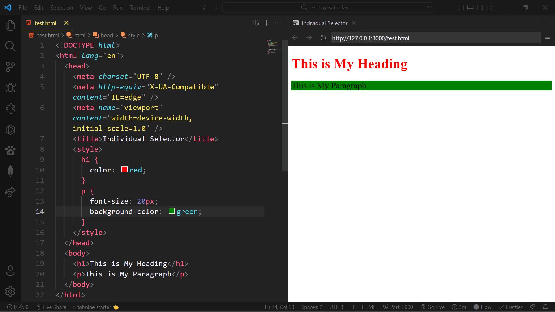
2. Individual Selector
In CSS we can simply select elements individually by targeting their tag names. The example is as follows
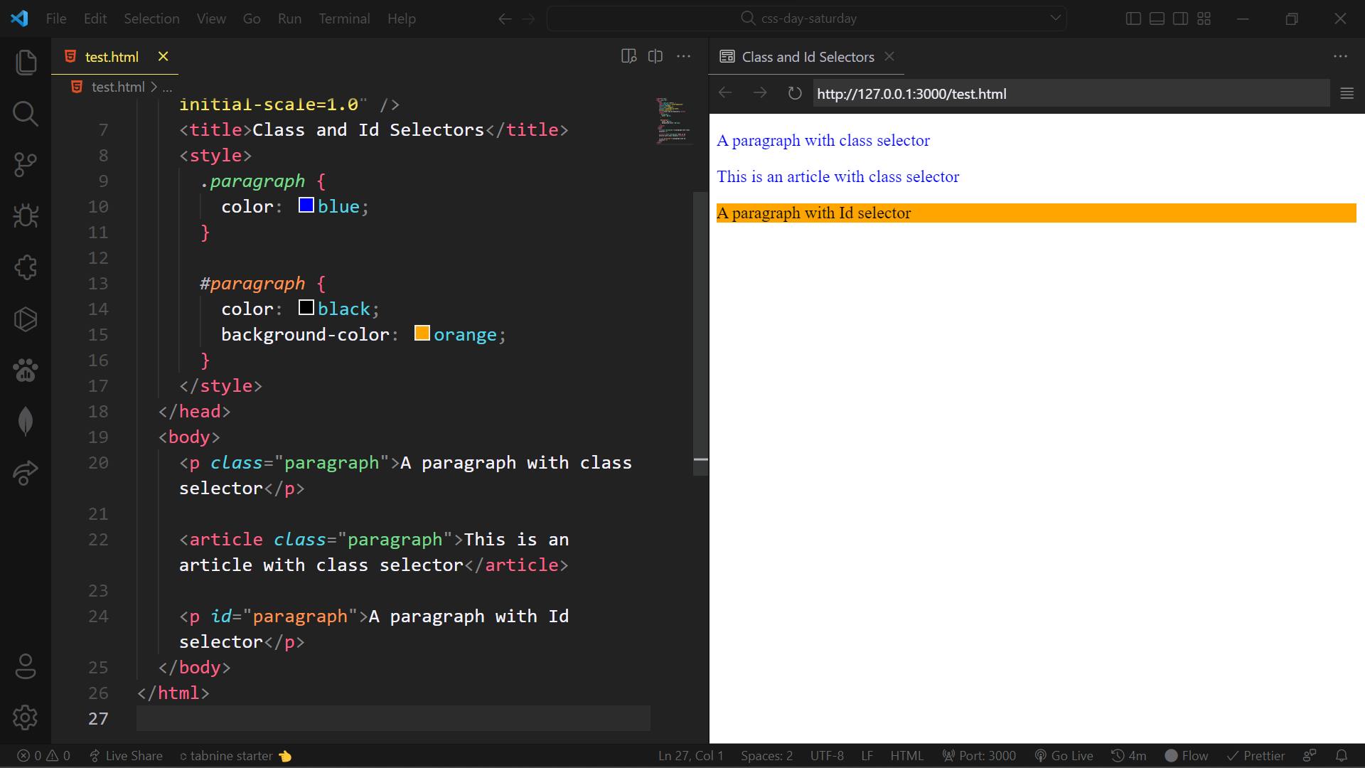
3. Class and Id Selector
CSS Class selector is a way to select elements with specified class names. The class selector starts with (.) - period followed by the class name. An HTML document can have many elements with the same class name. The browser then will look at tags containing the same class and applies styles to them.
CSS Id selector is also one of the ways of selecting elements by targeting their id names. An Id Selector must start with (#) hash symbol followed by id Name. The Id selector also acts the same as the Class selector, but the main difference between CSS Class and Id selectors is that we can have many elements in an HTML document with the same class name, whereas the Id Selector shouldn't. It means that we should only have one element with the same id name in the HTML document.
4. Chained Selector
We can also select by chaining elements in CSS. The example is as follows
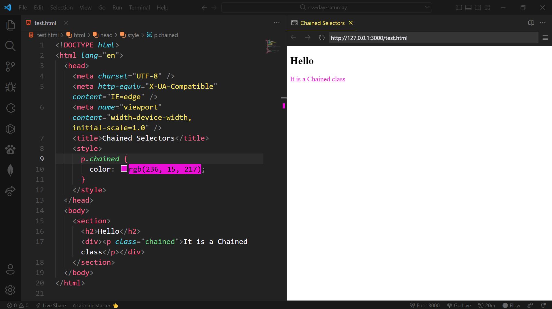
In the above code example the text "It is a chained class" is targetted by chaining the p element and "chained" class
5. Direct Child Selector
In CSS We can also select elements by targetting their direct child elements with the \> symbol. The Example is as follows
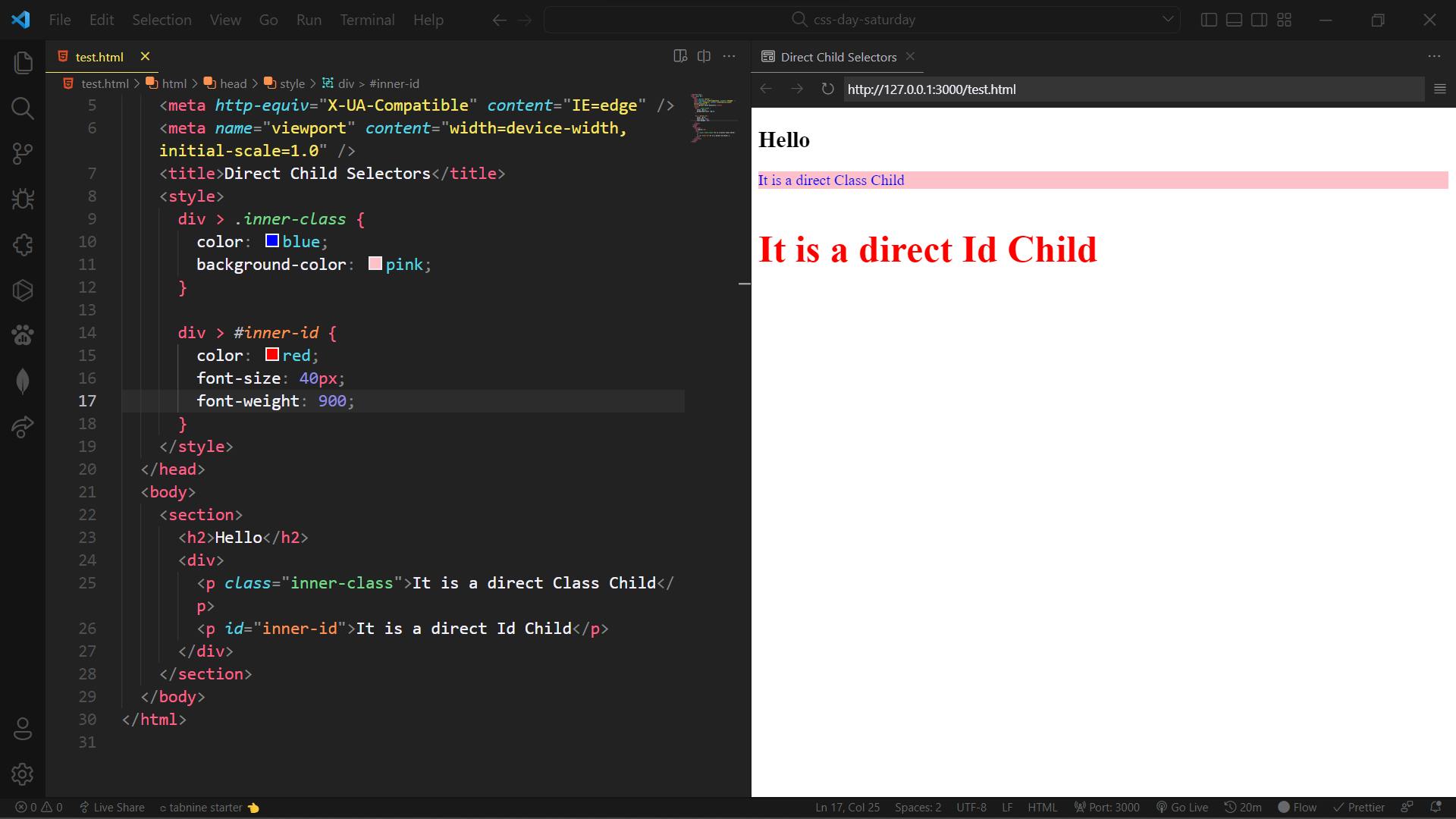
In the above code example, inner-class and inner-id are the direct child of div element
6. Sibling Selector
The general sibling selector selects all elements that are siblings of a specified element.
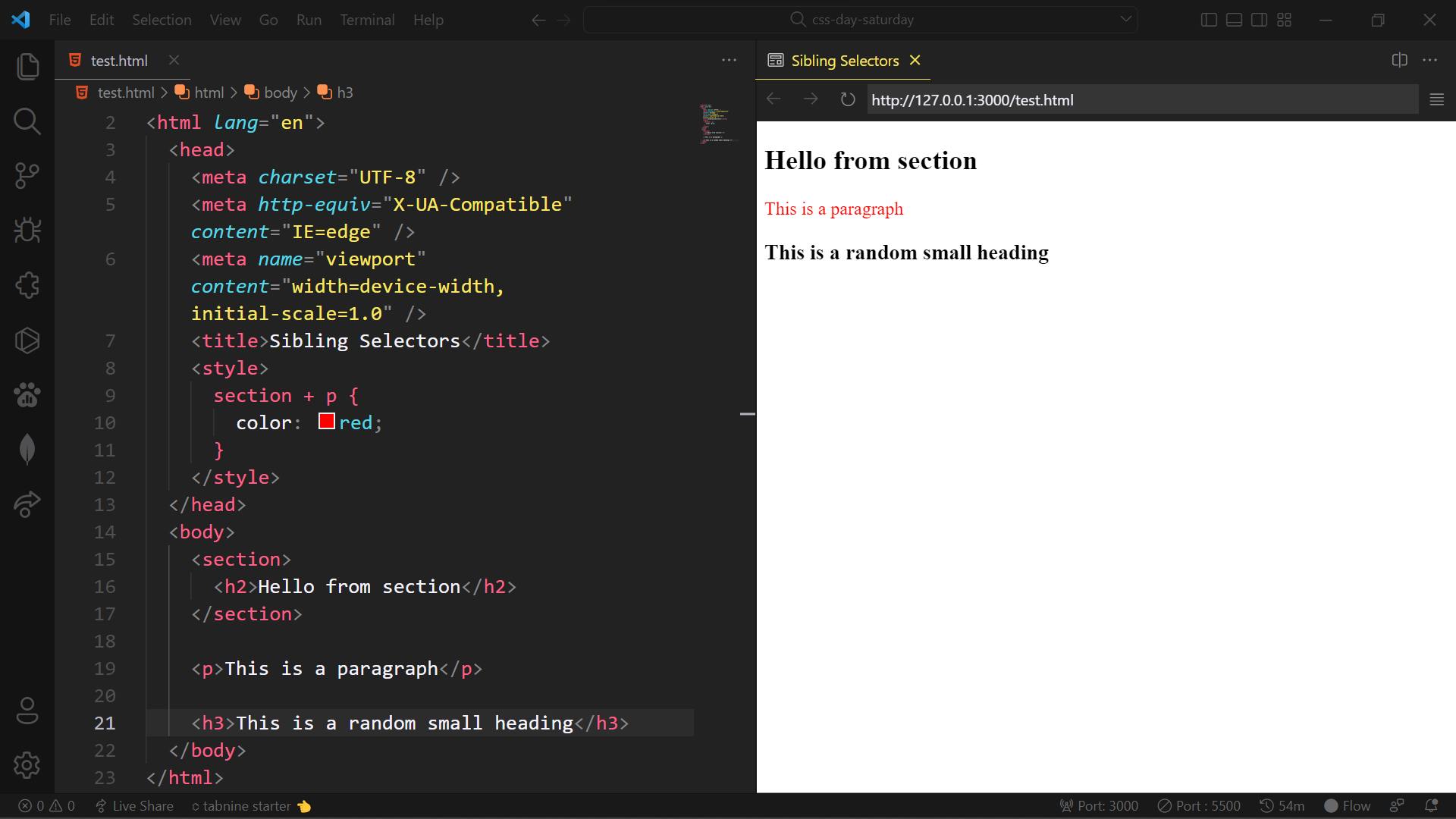
In the above code, example section element and p element are both siblings
Now, we will have a brief look at CSS Before and After Pseudo Elements
1. Before Pseudo Element
In CSS, :: before creates a pseudo-element that is the first child of the selected element. It is often used to add cosmetic content to an element with the content property. It is inline by default.
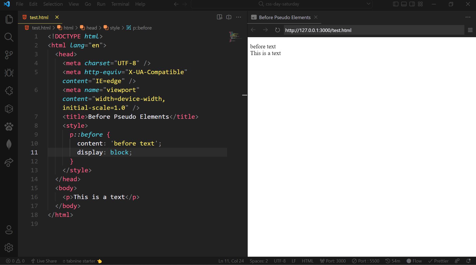
In the above example, we have set** content property value as "before the text"** to the selected element. So it gets added before the element.
2. After Pseudo Element
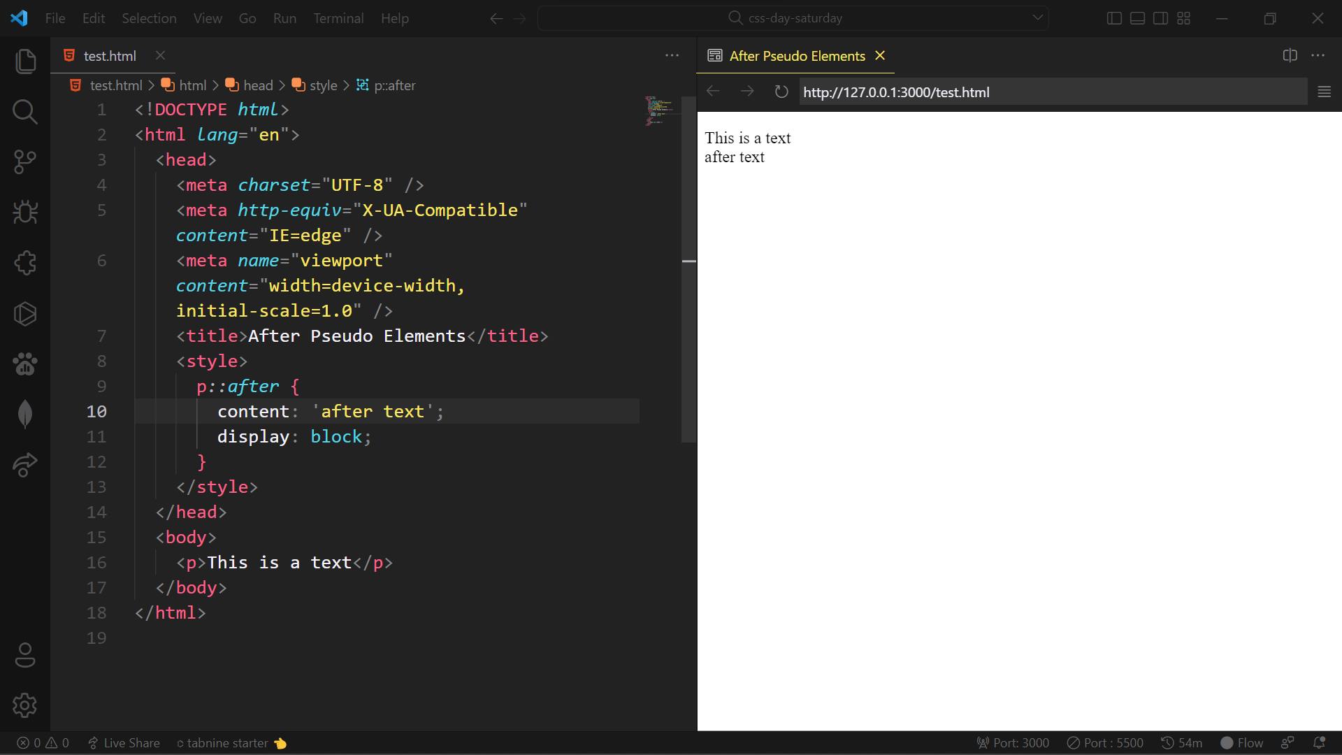
In the above example, we have set** content property value as "after the text"** to the selected element. So it gets added after to the element.
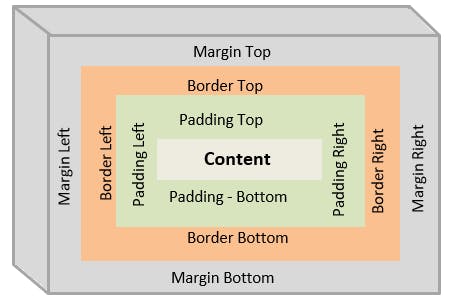
CSS Box Model
What is Box Model in CSS?
The CSS Box Model is a container that contains multiple properties including borders, margin, padding, and the content itself. It is used to create the design and layout of web pages. It can be used as a toolkit for customizing the layout of different elements. The web browser renders every element as a rectangular box according to the CSS box model. Box-Model has multiple properties in CSS. Some of them are given below:
Content : This property is used to displays the text, images, etc, that can be sized using the width & height property.
Padding : This property is used to create space around the element, inside any defined border.
Border : This property is used to cover the content & padding, the border property also have some extra properties named as border-width, border-style & border-color to style the border.
Margin : This property is used to create space around the element ie., around the border area.
The following figure illustrates the Box Model in CSS
Demonstration of CSS Box Model Properties using Source Code :
1 . Content :
Content is any HTML element which we write in order to apply styles to them.
<!DOCTYPE html>
<html lang="en">
<head>
  <meta charset="UTF-8">
  <meta http-equiv="X-UA-Compatible" content="IE=edge">
  <meta name="viewport" content="width=device-width, initial-scale=1.0">
  <title>CSS Box Model</title>
  <style>
    h1 {
      color: #ff0000;
    }
  </style>
</head>
<body>
  <h1>This is an HTML Content</h1>
</body>
</html>
Output :

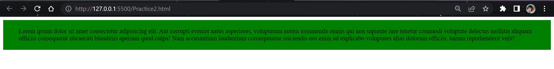
2. Padding :
The padding property further have it's own constituent properties to be styled.
*They are : * padding-top, padding-right, padding-bottom, padding-left. The padding applies starting on top and then to the right and then to the bottom and finally to the left(in clock-wise direction). The values to the Margin are px, rem, em and percentages(%).
Syntax :
h1 {
  padding-top: 10px;
  padding-right: 15px;
  padding-bottom: 10px;
  padding-left: 15px;
 }
We can also use shortand notation for padding property, the syntax is as follows
/* Apply to all four sides */
padding: 18px;

/* top and bottom | left and right */
padding: 10px 20px;

/* top | left and right | bottom */
padding: 12px 24px 12px;

/* top | right | bottom | left */
padding: 5px 10px 5px 10px;
Example :
<!DOCTYPE html>
<html lang="en">
  <head>
    <meta charset="UTF-8" />
    <meta http-equiv="X-UA-Compatible" content="IE=edge" />
    <meta name="viewport" content="width=device-width, initial-scale=1.0" />
    <title>Padding - Box Model</title>
    <style>
      div {
        background-color: green;
        padding: 20px 40px;

       /* the longhand notation for the above shorthand property is as follows */
        padding-top: 20px;
        padding-right: 40px;
        padding-bottom: 20px;
        padding-left: 40px;
      }
    </style>
  </head>
  <body>
    <div>
      Lorem ipsum dolor sit amet consectetur adipisicing elit. Aut corrupti
      eveniet natus asperiores, voluptatum autem assumenda omnis qui non
      sapiente iure tenetur commodi voluptate delectus mollitia aliquam officiis
      consequatur obcaecati blanditiis aperiam quod culpa! Nam accusantium
      laudantium consequuntur reiciendis eos enim ad explicabo voluptates alias
      dolorum officiis, harum reprehenderit velit!
    </div>
  </body>
</html>
Output :
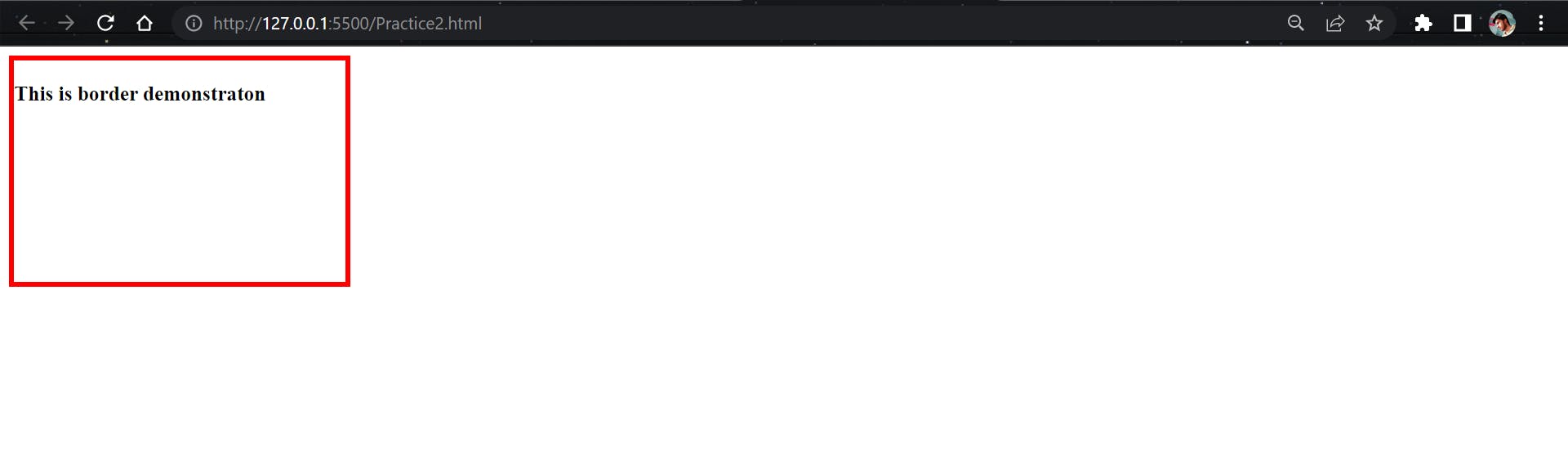
3. Border :
The Border property also have it's own properties to be styled.
*They are : ***1. border-width, ** it can be denoted using units px, em, rem & percentages (%)
*Syntax : *
p {
   border-width: 2px;
  }
2. border-style, the various border-style types are as follows
border-style: none;
border-style: hidden;
border-style: dotted;
border-style: dashed;
border-style: solid;
border-style: double;
border-style: groove;
border-style: ridge;
border-style: inset;
border-style: outset;

/* top and bottom | left and right */
border-style: ridge solid;

/* top | left and right | bottom */
border-style: none inset dashed;

/* top | right | bottom | left */
border-style: none ridge dotted groove;
3. border-color: it can be denoted using the normal color keywords such as red, blue, yellow, green etc and also using hex-codes such as #ff0000, #0a5943, #0f3754, #e5dcdb etc. We can also use other way of writing colors in CSS, they are rgb() values, hsl() values ans so on.
*Syntax :*   /* color values */
border-color: orange

/* top and bottom | left and right */
border-color: red #e5dcdb;

/* top | left and right | bottom */
border-color: yellow rgb(210, 80, 55, 0.4) lime;

/* top | right | bottom | left */
border-color: pink purple grey blue;
Example:
<!DOCTYPE html>
<html lang="en">
  <head>
    <meta charset="UTF-8" />
    <meta http-equiv="X-UA-Compatible" content="IE=edge" />
    <meta name="viewport" content="width=device-width, initial-scale=1.0" />
    <title>Border - Box Model</title>
    <style>
      div {
        width: 300px;
        height: 200px;
        border: 5px solid red;

        /* the longhand notation for the above shorthand property is as follows */
        border-width: 5px;
        border-style: solid;
        border-color: red;
      }
    </style>
  </head>
  <body>
    <div>
      <h3>This is border demonstraton</h3>
    </div>
  </body>
</html>
Output:
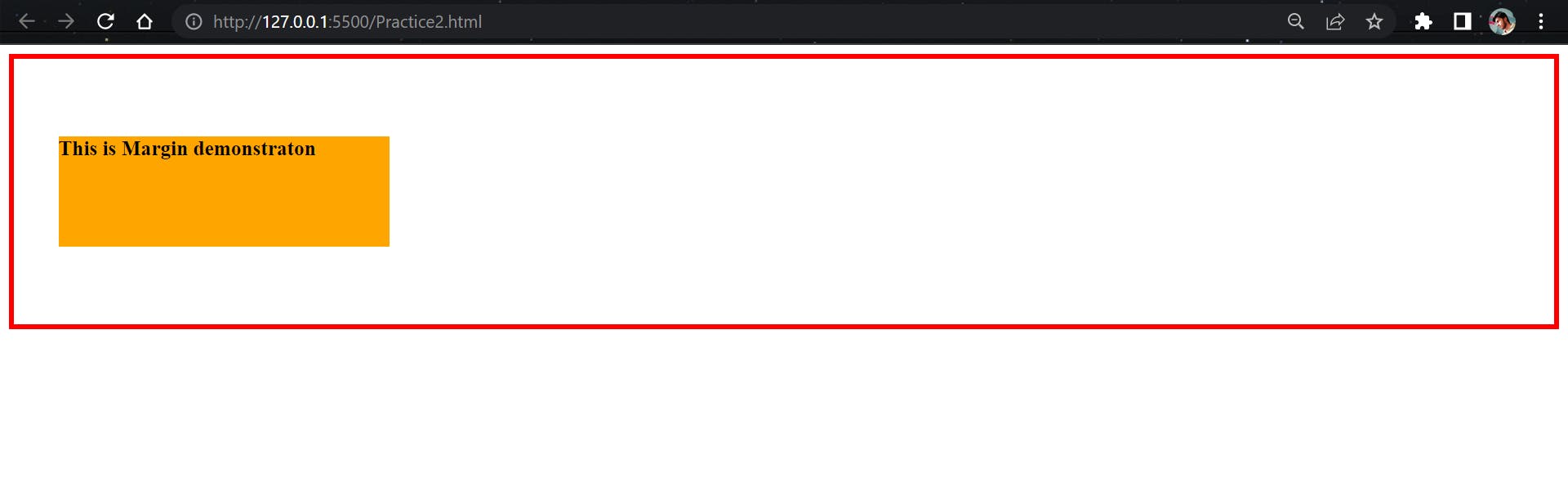
4. Margin :
Like padding The CSS Margin property also has it's own constituent properties to be styled
They are : margin-top, margin-right, margin-bottom, margin-left these also will be applied from top to left in clock-wise direction as applied to the padding property. The values to the Margin are px, rem, em and percentages(%).
Syntax:
/* Apply to all four sides */
margin: 4em;
/* We can also use negative values to the margin inorder to bring the element close to the other elements.*/
margin: -10px;

/* top and bottom | left and right */
margin: 5% auto;

/* top | left and right | bottom */
margin: 2em 60px 32px;

/* top | right | bottom | left */
margin: 20px 6em auto 32px;
Example:
<!DOCTYPE html>
<html lang="en">
  <head>
    <meta charset="UTF-8" />
    <meta http-equiv="X-UA-Compatible" content="IE=edge" />
    <meta name="viewport" content="width=device-width, initial-scale=1.0" />
    <title>Margin - Box Model</title>
    <style>
      .contaier {
        border: 5px solid red;
      }
      .inner {
        width: 300px;
        height: 100px;
        background-color: orange;
        margin: 70px 40px;

        /* the longhand notation for the above shorthand property is as follows */
        margin-top: 70px;
        margin-right: 40px;
        margin-bottom: 70px;
        margin-left: 40px;
      }
    </style>
  </head>
  <body>
    <div class="contaier">
      <div class="inner">
        <h3>This is Margin demonstraton</h3>
      </div>
    </div>
  </body>
</html>
Output:
CSS Flexbox
Flexbox in CSS is a way to align items in rows or columns. Flexbox is one dimensional unlike CSS Grid which is two demensional.
How it works?🤔
A flex container has flex-items in it, which can expands flex-items to fill the available free space in the direction which might be either row-direction or column-direction. If the items cannot fit into the available space then the items will go to the nextline in the container or shrinks in the same line.
The basic overview layout of Flexbox is shown in the following figure,
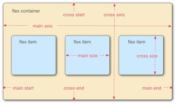
The Basic Terminalogies we should know before going to use Flexbox are:
👉 main-axis : The main axis of a flex container is the primary axis along which flex items are laid out.
👉 main-start | main-end : The flex items are placed within the container starting from main-start and going to main-end in main-axis.
👉 main-size : A flex item’s width or height, whichever is in the main dimension, is the item’s main size.
👉 cross-axis: The axis perpendicular to the main axis is called the cross axis. Its direction depends on the main axis direction.
👉 cross-start | cross-end : The flex items are placed within the container also starting from cross-start and going towards the cross-end in cross-axis.
👉 cross-size : A flex item’s width or height, whichever is in the cross dimension, is the item’s cross size.
Let's now discuss some of the flexbox properties along with thier values,
    display: flex; /* or inline-flex */
    flex-direction: row | row-reverse | column | column-reverse;
    flex-wrap: nowrap | wrap | wrap-reverse;
    justify-content: flex-start | flex-end | center | space-between | space-around | space-evenly | start | end | left | right;
    align-items: stretch | flex-start | flex-end | center | baseline | first baseline | last baseline | start | end | self-start | self-end;
    align-content: flex-start | flex-end | center | space-between | space-around | space-evenly | stretch | start | end | baseline | first baseline | last baseline;
      /* GAP */
    gap: 10px;
    gap: 10px 20px; /* row-gap column gap */
    row-gap: 10px;
    column-gap: 20px;
display: flex The flex property sets the flexible length on flexible items. Note: If the element is not a flexible item, the flex property has no effect.
Syntax:
.container {
        display: flex;
      }
flex-direction : The flex-direction property allows you to change the direction of the flex-items in either row-direction or in column-direction. By default, the flex-direction is laid toward the flex-containers main-axis which is row-direction here in our case.
Syntax:
.container {
        display: flex;
        flex-direction: column /* by default the flex-direction is row */
      }
flex-wrap : The flex-wrap CSS property** sets whether flex items are forced onto one line or can wrap onto multiple lines.** If wrapping is allowed, it sets the direction that lines are stacked.
Syntax:
.container {
        display: flex;
        flex-wrap: wrap /* the values can also be nowrap and wrap-reverse */
      }
justify-content : The CSS justify-content property defines how the** browser distributes space between and around content items along the main-axis of a flex container.**
Syntax:
.container {
        display: flex;
        justify-content: center; /* the values can also be  flex-start | flex-end | space-between | space-around | space-evenly | start | end | left | right */
      }
align-items : The CSS align-items property defines how the browser distributes space between and around content items along the cross-axis of a flex container.
Syntax:
.container {
        display: flex;
        align-items: center;  /* the values can also be stretch | flex-end | flex-start| baseline | first baseline | last baseline | start | end | self-start | self-end */
      }
align-content : The CSS align-content property sets the distribution of space between and around content items along a flexbox's cross-axis or a grid's block axis.
Syntax:
.container {
        display: flex;
        align-conten: start;  /* the values also can be flex-start | flex-end | center | space-between | space-around | space-evenly | stretch |end | baseline | first baseline | last baseline */
      }
gap : The gap property in CSS is a shorthand for row-gap and column-gap , specifying the size of gutters, which is the space between rows and columns within grid, flex, and multi-column layouts.
Syntax:
.container {
        display: flex;
        flex-direction: row;
        gap: 15px;  /* the values also can be gap | row-gap | column-gap */
      }
CSS Positions
What is Position Property in CSS?
CSS Position property allows you to position the elements at certain place in an HTML Document, i.e; in top, right, bottom and left directions.
There are 5 types of position properties in CSS , they are
static
relative
absolute
fixed
sticky
Let's now see what the above properties are and how do they work:
1. static
The static property is the default position property of all HTML elements. It does move(position) the elements in any directions instead will be laid in i'ts own position in HTML document.
Syntax:
selector {
      position: static;
    }
In the above shown example we have a background container with dark color and also have a box with yellow color. If we notice the above shown example the yellow color box was stayed on it'w own position although we have given it the postion of static. The above example demostrates that the Static position property has nothing to do with changing of element's position.
2. relative
The relative property is also another position property of CSS. An element with position: relative; is positioned relative to its normal position. It does not wrap around your head right!?
Let's see how does it work,
Syntax:
selector {
      position: relative;
    }
If we see the above given examle it looks same as the example showed in static - position but with one change of box color. In the static position we had a box with color of "yellow", whereas here in this relative - position example the box has a color of "cyan". If we carefully notice in this relative - position example the box has moved below and to right side from its original position which is** top - left** side. Oh!😮 why its happening like this...
Let me clarify it for you, in this example of demonstration we have given to the box position: relative along with that we also gave top: 50px; left: 50px;which causes the box to move 50px downwards and 50px to the right side. Looks cool right😉.
Play a little bit with it, so that it will be wrap around your head🙂.
3. absolute
Unlike relative position, the position: absolute; property position an element relative to to its parent elements position. If there is no position property set to the parent element, it uses the document body. So in-order to postion the element according to its parent element, we should need to give the parent element of property positon: relative;
Let's demonstrate it,
Syntax:
selector {
      position: absolute;
    }
The above example demonstrates the position: abolute property. If we notice the above shown example, we have a container and a box in it with color of "orange" has given to it. There, we have also given postion: relative; property to the container element which is parent element of the box element. we have given position: absolute; property to the box element, we also given bottom: 50px; , right: 50px; properties to the box, whch causes to move the box relative to the container which is its parent element, now the box has moved 50px bottom and 50px right to relative to the container element.
I Hope its gave an idea about absolute position property in CSS.
Note : The above mentioned two position properties are mainly used for positioning images and some other elements at certain place in an HTML Document.
4. fixed :
An element with position: fixed; property is positioned relative to the viewport, which means it always stays in the same place even if the page is scrolled. We can also use top, right, bottom, left propeties to position the element.
Syntax :
selector {
      position: fixed;
    }
In the above shown example, we some headings, paragraphs with random text and a box with color of blue. we have given position:fixed; to the box, along with the properties of top: 50px; right: 50px; which makes the box aligned to the top right corner of the page with gap of 50px. To elaborate the blue color box is fixed to the top - right corner to the page which means it wouldn't be moved any where at any cost, even the page is scrolled.
Play with the code to be more clear about fixed position property.
5. sticky :
An element with position: sticky; is positioned based on the user's scroll position. It is the combination of both relative and fixed positions.
Let's try to demonstrate it,
Syntax :
selector {
      position: sticky;
    }
The above example have some headings, some paragraphs with random text and a box with color of "purple" . We have given the position: sticky property to the box also have given top: 100px; When we scroll the page we can notice that the box moves up along with scroll and get sticked at the top of the page with gap of 100px at certain point. Yeah! this how the position: sticky; property behaves.
First of all, it will be positioned on it's own place, when the page scrolls it will start moving to the direction in top, right, bottom and left directions relative to the viewport(we can say that , it obeys to the relative position) to which values are given to it as it reaches to that point on page it wiil get fixed there(we can say that , it also obeys to the fixed position).
What is a Media Query in CSS ?
Media query is a CSS technique used in CSS.
It uses the @media rule to include a block of CSS properties only if a certain condition is true. Media queries are a key part of responsive web design, as they allows you to create layouts depending on the device viewport and the environment your site in running on
Need for Media Queries ?
When the web was first introduced, website were made particularly to run on Desktop Browsers which had wider length of screens. The website were only fit into the desktops screen. As the time passes and technology started to grow, mobile phones and tablet devices were introduced and people started using mobile phones and tablets more than Desktop Computers. Because Mobile Phones and Tablet Devices are more portable than desktops. Now the problem is, the websites which were created to run on desktop browsers are not able to run on Mobile phones and tablets browsers, because mobile phones and tablets Screens are smaller as compared to Desktop Screens. That's where the concept of Media Queries comes in handy. Media Queries allows us to create website layout according the device width. This is what we called as Responsive Web Design (RWD) in Great Terms.
Let's see the stucture and usage of Media Queries :
The simplest media query syntax looks like this:
  /* CSS rules go here */
}```

It consists of :

- A media type, which tells the browser what kind of media this code is for (e.g. print, or screen).
- A media expression, which is a rule, or test that must be passed for the contained CSS to be applied.
- A set of CSS rules that will be applied if the test passes and the media type is correct.

### Media types

The possible types of media you can specify are:

- all
- print
- screen

we can simply use ```
@media(media-feature-rule){}
``` without specifying any other media types because, by default the media type is set to **all**.
So, you can **omit **specifying the media type.

Let's see a simple example on media queries :

The following media query will only set the body to ```
color: red
``` if the page is printed. It will not apply when the page is loaded in a browser.
@media print { body { color: red; } } ```
Media feature rules
After specifying the type, you can then target a media feature with a rule. A Media feature rule can be used to check many things, such as: width and height of the viewport — using the min-width, max-width, and width media features.
In practice, using minimum or maximum values is much more useful for responsive design so you will rarely see width or height used alone.
These feature rules are used to create layouts that respond to different screen sizes. For example, to change the body text color to orange if the viewport is exactly 760pixels, you would use the following media query.
@media(max-width: 760px) {
  body {
    color: orange;
  }
}
max-width : The max-width(short form of maximum width) property is used, when we want to target a specified width of screen and apply all of our CSS styles upto that width.
min-width : The min-width(short form of minimum width) property is used, when we want to apply styles starts from a certain width and keep on applying them to the certain width.